Optical Illusions of the Parthenon: How They Fool the Eye
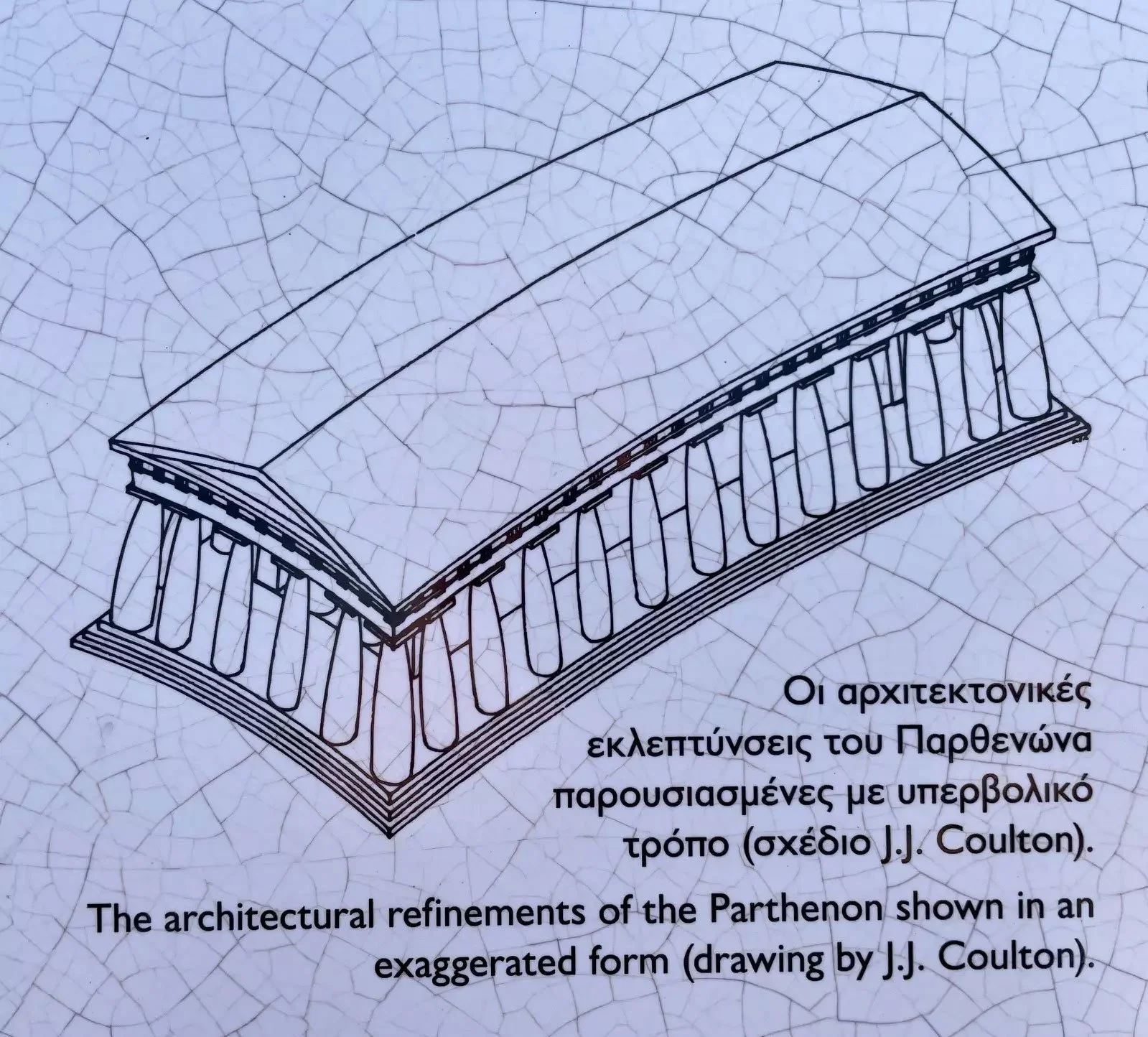
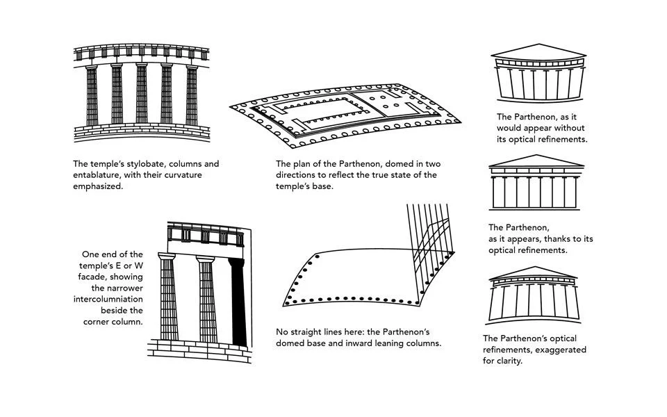
Exaggerated drawings make the refinements easier to see because the real adjustments are extremely small.
The Parthenon looks like the cleanest, straightest, most “perfect” temple ever built.
And that’s the trick.
If you could freeze time, lift the building into a neutral white void, and measure it like a modern box, you’d find something surprising: parts of the Parthenon are not perfectly straight, not perfectly identical, and not perfectly “regular.” On purpose.
This article is the beginner-friendly explanation of why those “imperfections” exist and how they work. We’ll look at the main optical refinements (the gentle curves, the column tweaks, the spacing decisions), and we’ll connect them to the real goal of Greek architecture: not mathematical purity for its own sake, but perceived harmony.
Definition: An optical refinement is a small adjustment that improves how a building looks.
The Parthenon isn’t perfectly straight because our eyes don’t see perfectly straight
This is the core claim, and it’s the most human part of the whole story.
Long horizontal lines can appear to sag. Very tall verticals can look thinner in the middle. Corner columns can look visually “weaker” because they’re framed by bright sky on two sides. Even perfectly equal spacing can feel unequal when it meets a corner.
Greek architects knew this. They weren’t building for a laser scanner. They were building for a moving human viewer, standing below, walking around the temple, looking up into harsh daylight.
If you want a grounding baseline for this mindset, it helps to remember how Greek temples function visually. A temple is designed to be approached, circled, and read from outside. That’s the logic behind how temples are designed to be seen.
So the “illusion” isn’t a cheap trick. It’s a correction. It’s architecture acknowledging that perception matters.
And the Parthenon is a masterclass in this approach. Its refinements are small enough that many visitors never consciously notice them. But the overall effect is huge. The building feels stable and controlled in a way that’s hard to achieve at that scale without adjustments.
This is why “perfect” is not the same as “perfectly straight.” Perfect, in Classical design, often means “perfectly convincing.”
The Parthenon uses tiny curves and angle shifts so the building looks more regular to the human eye.
The platform is gently curved, and that changes how the whole building reads
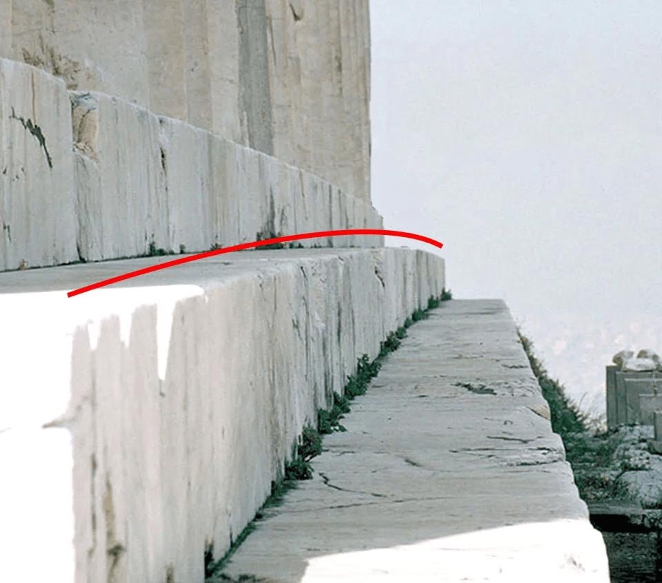
The most famous refinement sits under your feet.
The Parthenon’s top step platform (the stylobate) is not a flat ruler-straight line. It rises slightly toward the center. The amount is subtle, but the intent is clear: prevent the eye from reading the long base as sagging.
It helps to connect this to key measurements, because once we’re talking about a footprint around 70 meters long, even a tiny correction becomes a real design commitment. If you want a long line to look straight to the human eye, you sometimes have to bend it.
This “curve” story also reminds us of something basic: the Parthenon is not a single rectangle. It’s a whole set of rectangles and rhythms layered on top of each other, each one influencing the next. A curve in the base affects the reading of columns. Columns affect the reading of the entablature. The entablature affects the reading of the pediment. The whole façade becomes a perception machine.
And this is where it’s useful to think like a designer. The Parthenon isn’t trying to be an abstract diagram. It’s trying to create a stable experience under real conditions.
So when people say, “The Parthenon is mathematically perfect,” the more accurate sentence is: it’s perceptually perfect. It’s tuned to how we see.
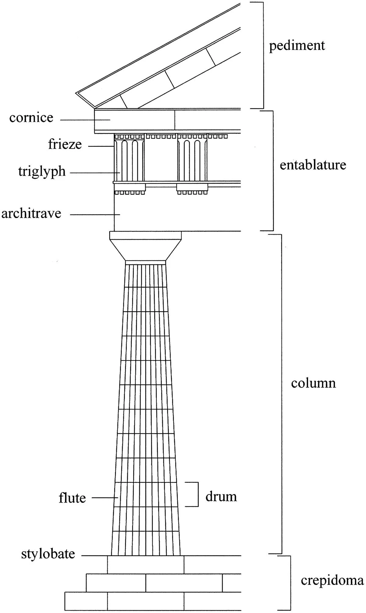
Optical refinements affect several parts of the Doric system, not just the columns.
Columns are adjusted so they look strong, not thin or weak
If the stylobate is the quiet curve, the columns are the quiet choreography.
Two big ideas matter here:
Entasis: a slight bulge in the column shaft so it doesn’t look pinched.
Inward inclination: columns can tilt slightly inward so the temple reads as stable.
In plain words, a perfectly straight column can look thinner in the middle. Entasis corrects that illusion by giving the shaft a subtle swelling. It’s not a “decoration.” It’s a visual correction.
Corner columns are another classic problem. A corner is a high-contrast zone. Sky on two sides makes the column look more exposed. Greek architects often responded by giving corner columns subtle compensations: they may appear slightly thicker, or their spacing may be adjusted so the corner feels as strong as the center.
This is where the Parthenon becomes less “perfect object” and more “perfect decisions.” Someone had to notice the optical problems. Someone had to decide which corrections to use. Someone had to control execution across the whole perimeter.
That’s why the human names matter. The refinement story belongs to the people who led the design and delivery. If you want that lens, architects and design choices is the cleanest way to connect the optical tricks back to real responsibility.
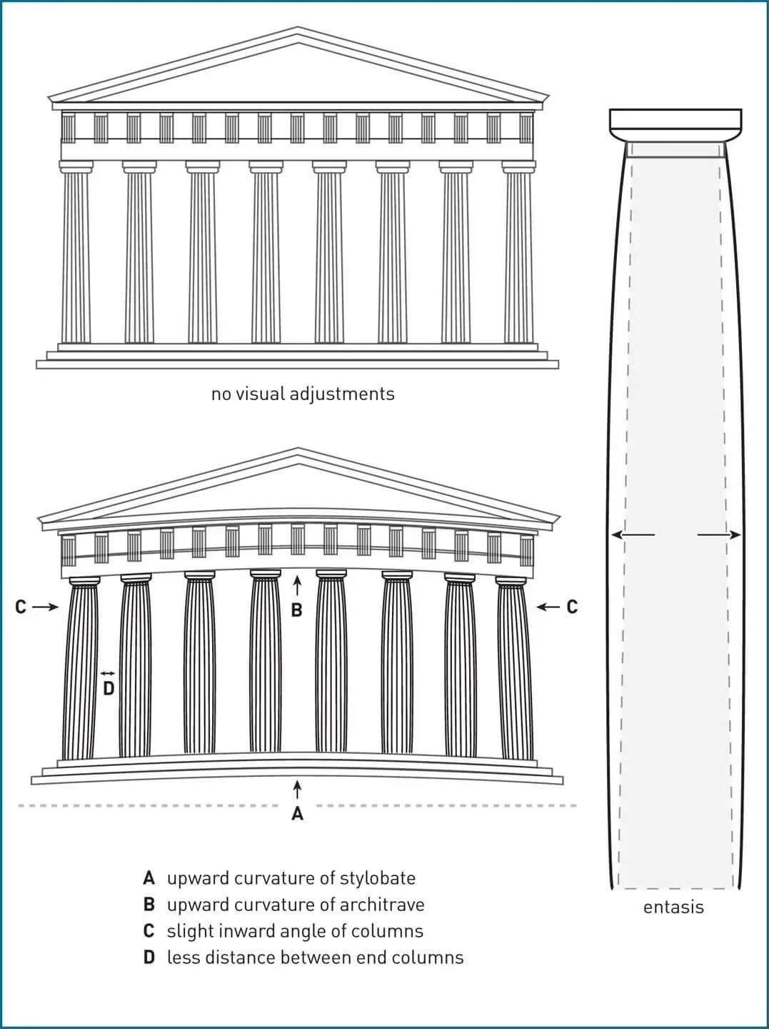
This diagram shows the main refinements clearly: curved lines, inward tilt, tighter corner spacing, and column swelling.
Spacing is not uniform because uniform spacing doesn’t always look uniform
This is the refinement that feels counterintuitive until you see it.
We assume equal spacing is fair and therefore visually correct. But on a colonnaded temple, the corners break that assumption. A corner bay can look wider, or emptier, or less supported, depending on how the light hits it and how our eye groups the pattern.
So Greek architects often used subtle spacing adjustments, especially near corners, to keep the rhythm feeling consistent.
The Parthenon’s colonnade is a repeating beat. Your eye reads it as a pattern. If the pattern “hiccups” at the corner, the whole façade can feel unstable. So the building treats the corners like problem areas that need special care.
This is where how Greek architecture handles perception becomes the bigger lesson. Greek architecture isn’t only about geometry. It’s about geometry filtered through human vision. The Parthenon’s refinements are not random quirks. They are the architectural version of a painter adjusting contrast so a figure reads clearly from across a room.
And once we understand spacing as perception management, we start seeing Greek design as intensely pragmatic. It’s not “mystical math.” It’s visual intelligence.
The stylobate is not perfectly flat: it rises slightly toward the center.
These refinements are why the golden ratio myth is tempting, but not necessary
The Parthenon looks so harmonious that people want one single key.
That’s where the golden ratio claim often enters: if the building feels mathematically elegant, surely it must hide a famous elegant number. But the Parthenon doesn’t need that story to be sophisticated. Its sophistication is already visible in its corrections.
Refinements also complicate the idea of one fixed rectangle controlling everything. If the building is slightly curved and subtly adjusted, then any ratio claim depends heavily on what you choose to measure and where you draw your boundary lines.
That’s why the most honest framing is the one you already built into your content ecosystem: proportion myths, not proportion certainty.
If you want the clean beginner takeaway, it’s this: the Parthenon’s beauty comes from repeatable proportion thinking plus perception-corrections. It’s engineered harmony, not a single hidden number.
And to see how scale makes these corrections necessary, the measurement overview in key measurements is the perfect reality check. Big buildings amplify small distortions. The Parthenon responds by correcting those distortions at the source.

Conclusion
The Parthenon “fools the eye” by respecting the eye. It uses optical refinements to correct how we misread long lines, tall columns, and corner conditions. The platform subtly curves so it doesn’t look like it sags. Columns subtly swell so they don’t look thin. Spacing is tuned so the rhythm feels consistent. And those choices add up to the feeling we call “Classical perfection.”
Once we see these refinements, the Parthenon stops being an abstract icon and starts being a design lesson: harmony is something you build, test, and adjust for real human perception.
FAQ
What are the “optical illusions” of the Parthenon?
They’re subtle design refinements (curves and adjustments) that make the temple look straighter and more balanced to the eye.
Is the Parthenon perfectly straight?
No. Some elements are slightly curved or adjusted on purpose to correct visual distortion.
What is entasis?
Entasis is a slight swelling of a column shaft so it doesn’t look pinched.
Why do corner columns matter so much?
Corners create strong visual contrast, which can make columns look weaker unless the design compensates.
Does this prove the Parthenon used the golden ratio?
No. Optical refinements show the building is tuned for perception, and golden ratio claims depend on selective measuring.
Sources and Further Reading
You may also like